Design system
How an OzarLand memo looks, and why. The goal is that an operator recognises a memo before reading a word of it,
and that the twentieth and the two-hundredth look like the first. The rules below are implemented in
templates/tokens.css, templates/memo.css and
templates/memo.cjs, and enforced by the build wherever a rule can be checked.
Principles
- One memo, one lesson. If a memo needs two lessons, it is two memos.
- Ink on paper, colour for risk. Colour never decorates and never marks a category. It says one thing: how risky an action is, or whether a state is healthy.
- The picture shows the mechanism. A diagram earns its place by showing where a request stops, which case applies, or what differs between two things that look alike. No illustration, no screenshot, no ornament.
- Readable on a phone. The memo is designed for a 1080 px wide image seen about 375 pt wide. Content is never smaller than 19 px, labels never smaller than 18 px.
- Text is cut by its author, never shrunk by the template. There is no auto-fit. A sentence that does not fit is rewritten.
- Simplify the presentation, not the reality. A memo may leave things out; it says so under Where this holds. It does not state as universal what a runbook observed in one place.
Format
| Canvas | 1080 × 1350 px, portrait (LinkedIn 4:5) |
| Export | PNG at 1× in dist/. --scale 2 gives 2160 × 2700 for print or slides |
| Margins | 52 px left and right. The header tab and the lesson band bleed to the edges |
| Language | English, OpenStack terminology as upstream writes it (nova-compute, BUILD, Placement, floating IP) |
The signature
Four things make a memo recognisable without its name:
- The memo tab: a solid ink block at the top left, flush with the corner, with the memo number in monospace
(
PG·07). - The lesson band: the bottom of every memo is a full-width ink band with the operational lesson in large type. It is the first thing read in a feed and the last thing remembered.
- Square-bullet section labels in spaced monospace capitals:
■ FIRST CHECKS,■ THINK BEFORE ACTING. - Warm paper, white card: the page is off-white, and the diagram sits on the only white card.
The OzarLand mark (assets/brand/ozarland-mark.svg) is a cloud above a ground
line on an ink square: the cloud of the OzarLand banner, and the "shared land". It appears once, small, in the
header, next to OzarLand / production guide, the name of this module of OzarLand Academy.

Layout
Top to bottom, always in this order:
| Zone | Content | Rule |
|---|---|---|
| Header | Memo tab, category, signature | Fixed, 54 px |
| Title | The situation as a question or statement | 72 px; 62 px above 24 characters; two lines at most |
| Situation | What is seen and what it means | 26 px, three lines at most |
| Diagram | One component, an optional caption and note | White card |
| First checks | Exactly four, numbered, in a 2 × 2 grid | Label 24 px, command hint in monospace 19 px, two lines at most |
| Think before acting | One or two items | 24 px, tinted by risk level |
| Lesson band | Label, the lesson, the runbook reference and its status | Lesson 37 px, two lines at most |
The height left over once every zone has its natural size is shared between the zones, never left in one place.
Colour
| Token | Value | Use |
|---|---|---|
--paper |
#f4f1ea |
Page background |
--card |
#ffffff |
Diagram card |
--ink |
#0e1a2b |
Text, memo tab, lesson band, neutral diagram nodes |
--ink-2, --ink-3 |
#435268, #76839a |
Secondary text, labels |
--line |
#d8d3c6 |
Borders |
--ok, --ok-bg, --ok-line |
#15803d, #dcfce7, #16a34a |
Read-only, healthy |
--warn, --warn-bg, --warn-line |
#b45309, #fef3c7, #d97706 |
State-changing, waiting, degraded |
--stop, --stop-bg, --stop-line |
#b91c1c, #fee2e2, #dc2626 |
Destructive, failed, to avoid |
--mute, --mute-bg, --mute-line |
#4b5563, #f3f4f6, #9ca3af |
Neutral, not involved |
The tints and lines are the OzarLand status colours, so a memo and a runbook colour the same risk the same way. No gradient, no shadow, no other colour.
In a diagram a tone is written as ok, warn, stop, mute or ink. Use ink for a step that is neither good
nor bad. In a numbered sequence the tone is the risk of the step (a red step is a destructive action); elsewhere it
is its state (a red node is where it failed).
Typography
| Role | Face | Size | Weight |
|---|---|---|---|
| Title | Inter | 72 / 62 px | 800, tight tracking |
| Lesson | Inter | 37 px | 800 |
| Situation | Inter | 26 px | 400 |
| Checks, cautions | Inter | 24 px | 700 for labels, 400 for text |
| Diagram labels | Inter | 22 px | 700 |
| Diagram details, notes | Inter | 20 px | 400 |
| Commands, states, paths | JetBrains Mono | 19 px and up | 500 |
| Section labels, footer | JetBrains Mono | 18 px | 600 to 700, capitals with wide tracking |
Two families, both vendored in assets/fonts so that every machine renders the same image.
Anything typed at a prompt or returned by an API is in monospace: commands, option names, states, log messages.
In the sources, wrap it in backticks.
Icons
Lucide outline icons, 2 px stroke, in the colour of the text around them, from
assets/icons. One icon per diagram node at most, chosen for the object it stands for (a
server, a network, a disk), never for mood. No emoji on a memo: they render differently on every system.
Diagram components
Three components cover the first collection. Choose by what the memo must show.
| Component | Shows | Use it when | Limits |
|---|---|---|---|
chain |
A path from left to right, with arrows that can be broken or point backwards, and nodes that can be numbered | A request stops somewhere (PG-01, PG-10), or steps must happen in an order (PG-07, PG-20) | 2 to 5 nodes |
branches |
"If you see this, the case is that" | The same symptom has several causes told apart by one observation (PG-02, PG-16, PG-17) | 2 to 4 rows |
compare |
Two to four columns side by side, each with a verdict | Two things look alike and are not (PG-06, PG-08), or several views of one object disagree (PG-05, PG-13) | 2 to 4 columns, 4 points each |
Every component takes an optional caption above it and a note below it. The fields of each are in
templates/memo.yml and in the existing memos.
A new component is justified when a lesson cannot be told with these three, not when a memo would merely look
different. Add its function to templates/memo.cjs, its styles to templates/memo.css with the existing tokens,
its validation to scripts/lib/content.cjs, and a row to this table.
Writing for the template
- Title: what the operator would type into a search box. A question when the memo diagnoses, a statement when it gives a rule ("Fence before you evacuate").
- Situation: the symptom first, then the one fact that reframes it.
- First checks: a label that says what to look at, and a hint that says where. Read-only, always: if a command changes anything, it does not belong here.
- Think before acting: the level, then the consequence.
destructiveandstate-changingmean what the risk warnings say.avoidis for the tempting shortcut.knowis for a fact that changes the decision. - Lesson: one or two short sentences that still make sense a month later, without the memo.
| Field | Budget |
|---|---|
| Title | 40 characters |
| Situation | 190 characters |
| Check label, check hint | 38, 70 characters |
| Caution | 150 characters |
| Lesson | 100 characters |
| Diagram note | 150 characters |
The budgets are necessary, not sufficient: the build also renders the memo and fails if anything overflows.
The collection at a glance
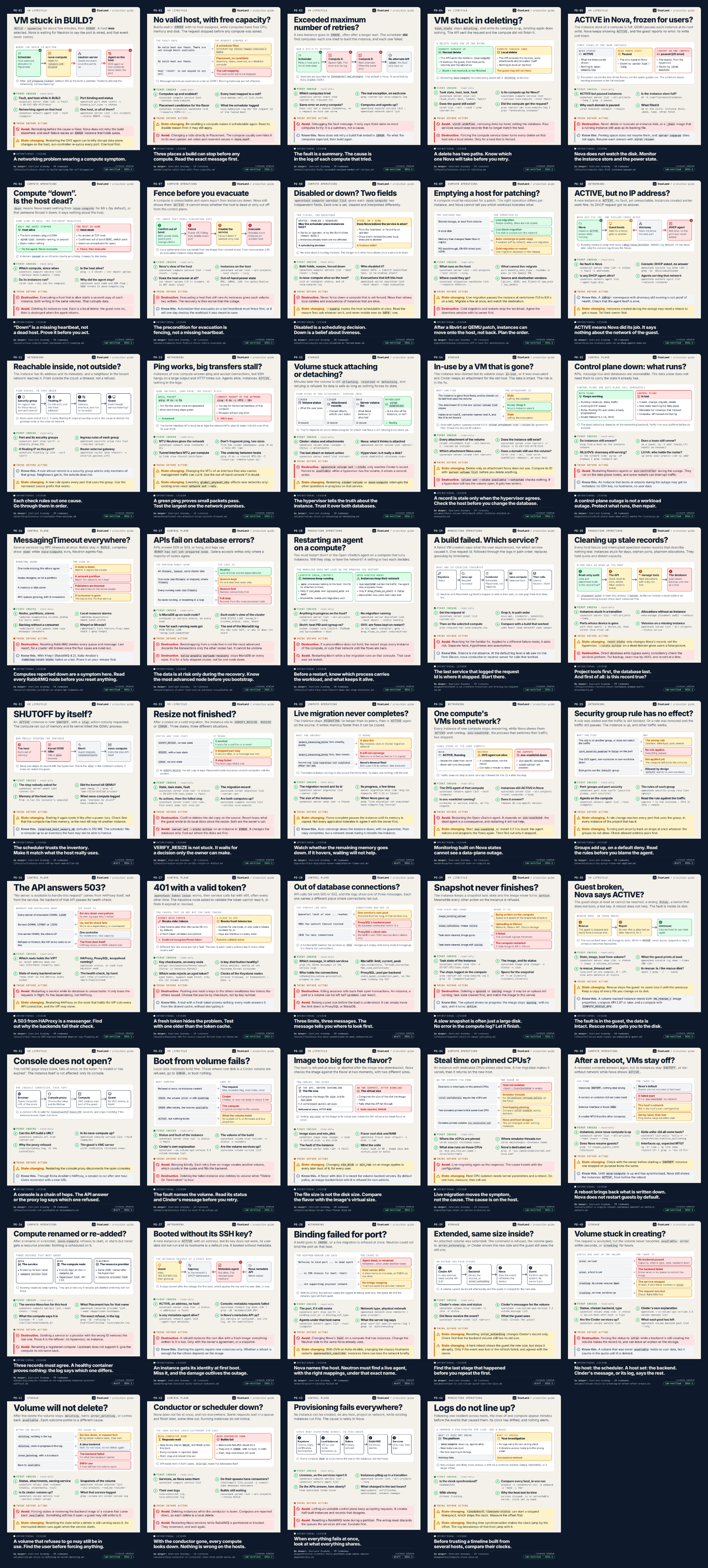
What a memo never has
Dense paragraphs. Terminal screenshots. Decorative illustrations. Gradients. A second accent colour. A style of its own.